Learning project 1
I think I met the brief for this project as best as I could. It was a steep learning curve for the animation. I think i was a bit unaware of the animation coming up. I was happy designing the CD box, and I wasn't really prepared for the animation. I think I need to work very hard in this unit because I'm not doing the concurrent director unit that everyone else is doing. The thing I need to learn from this project is to get down to work and really try to learn animation skills, because I am very lacking in the most basic technical details, having no animation background. This would help me be able to execute my ideas better, but it has been good to be pushed to learn, and I am quite happy with what I have learned to meet the brief.
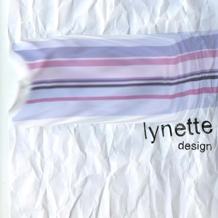
I'm happy with the finished product. I think I was quite successful in bringing my ideas to fruition, I like the colours and texture of the finished box, and overall I'm quite happy with my animated gif, I quite like the movement of the stripe, after much improvement. I found it hard to make the web page, I'm doing an internet design unit at the moment and hope to learn about web page design, because I feel I am very lacking in this area. We are learning CSS which I think will be a useful tool to learn to help layout.
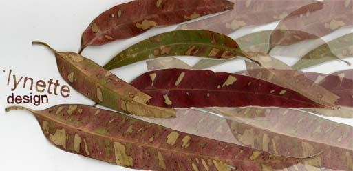
I have learned a valuable reminder to get ideas and inspiration away from the computer. I think this is the most valuable thing I have learned and will take away from this project. Although the work must be computer based, I'm very happy with the results I only started to get when I started experimenting away from the computer. I found the reading on handmade graphics very inspiring in this.
Animation
I found the idea of making an animation daunting because I don't have any experience, and I am not doing the intro unit that other people are doing. I decided to learn how to do annimated gifs using image ready, because I thought this would allow me to learn enough to make an annimation in the short space of time.
I wanted to annimate the stripe moving across the paper. I wanted to have it like the stripe was uncrinkling the paper as it went.
The annimated gif seemed to be a good way to introduce me to trying to think about animating. I produced each frame as a different layer in photoshop and then moved into image ready to make the gif.
Design Development
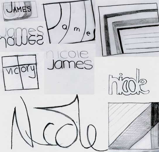
I decided to develop this sketch further:
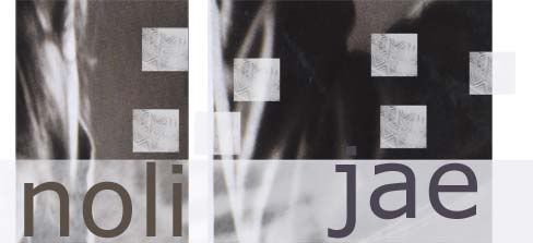
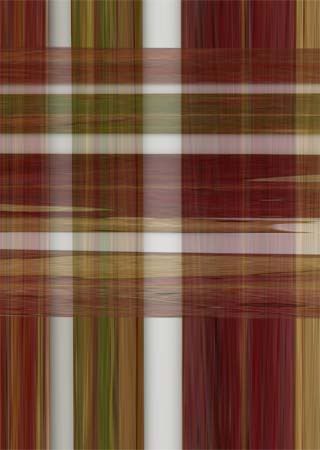
I took a band of the colours that I found in this sketch and played with them. I tried printing it out and doodling on it, handwriting the lynette, and drawing onto printouts of the design. Some of the printouts I crumpled up because I didn't like them. Then I scanned it. to give more texture and movement, like in a handmade graphic.
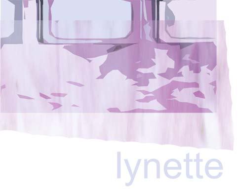
I used a hand drawn lynette to finish it off.
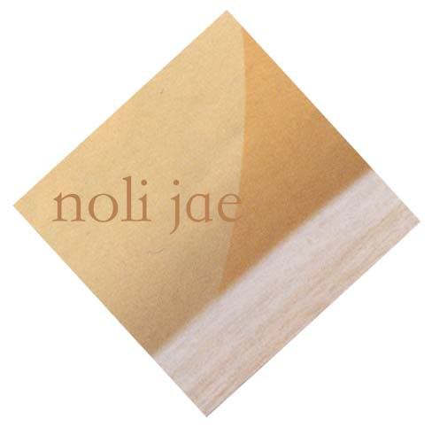
I then blurred the stripe on the computer, to give it a more fluid movement feel, which contrasts to the crinkled paper.
It reminds me too of the french flag in the "liberty leading the people" painting.
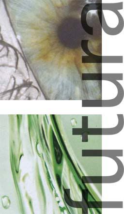
I think it has the feeling of movement in the stripe and crincled paper, even though the final print out will be flat, it has the feel of a worn piece of paper, that is an intersting texture to place as a CD cover, in a plastic box, very rigid and perfect. While the design is delibrately textured imperfectly.
Handmade graphics
The reading on handmade graphics reminds me of the attraction to rough edges imperfections and handmade elements and even 'mistakes' in design. Rather than computer images that tend to be 'perfect' and flat, handmade graphics have a depth and an attraction that computer generated graphics can lack.
By using other methods than computer, you have more possibilities. You have to improvise, explore and create inventive solutions to design problems that you otherwise might not have thought of.
An example of a website that i found that has elements that have a handmade feel is:
http://www.csszengarden.com/?cssfile=/165/165.css&page=3, by Rob Soule
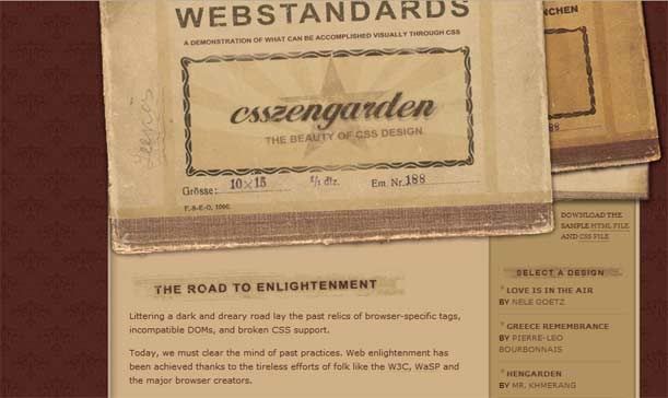
THe texture of the tickets creates a feeling of it being printed on actual paper, and worn out as an actual object textured. There is also handwriting on the left hand of the ticket. The webpage combines these 'handmade'-like textures with computer font well, and it creates interest while maintining readability for the text.
F.T. Marinetti, Words-in-freedom: olfactory, tactile, thermal 1932:
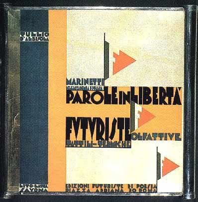
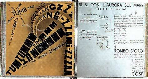
This 'mechanical book' by Marinetti, was in the futurism style made in 1932. It is probably not strictly handmade, and it is ironic that it was created as a mechanical book, but i have included it as an example of handmade graphics. It just has the feel of handmade, not typeset by a computer, the type is quite free and curves into the page. It doesn't look like what I'd associate with being mechanically produced (from my standpoint in 2006) but back in 1932 it was apparently very mechanical. The book itself was printed on sheet metal. The typeography, feels far more free than computer type, and it is very effective graphically.
Issue one 2006, Grok cover by Paul Ikin:
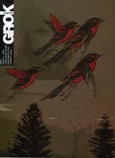
This grok cover incorpotates hand drawn birds, and 'handmade' textures, like the cloth background, with vector-like trees and a backround image of a girl that could be hand-drawn or could be a filter effect. All this combined makes this image have more depth because the hand drawn birds and the other different styles incorporated together make the image feel sort of hand-made. This shows how computer and hand techniques are effective if combined well.
These are two examples of hand drwan typography from the "New handmade graphics"
Style
From my research into the meaning of my name, Nicole, "victory of the people". I couldn't help associating it in my head with the painting of the french revolution by Delacroix "liberty leading the people."
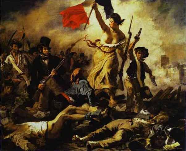
Eugène Delacroix. Liberty Leading the People (1830)
I find this painting striking because the woman holding the french flag and gun, on top of dead bodies, seems horrific - showing the awful bloodshed of the french revolution, but the liberty figure triumphs. The liberty figure seems like something out of an anchient legend, like liberty personified as a woman. This woman is so striking, and it is such a strong image, i would like to have an image that was victorious, forward moving, liberating for my design.
I also find the movement of the french flag in the painting grabs my attention, probably helped by it being red and centrally placed.
While I was looking in the art book, i came across some art in the futurism style. I thought it was interesting because it attempts to capture movement in a still image. I think this style could be relevant to considering designing a moving image for the annimation, and also relevant in trying to design an image for the CD case that captures the idea of movement in a still image.
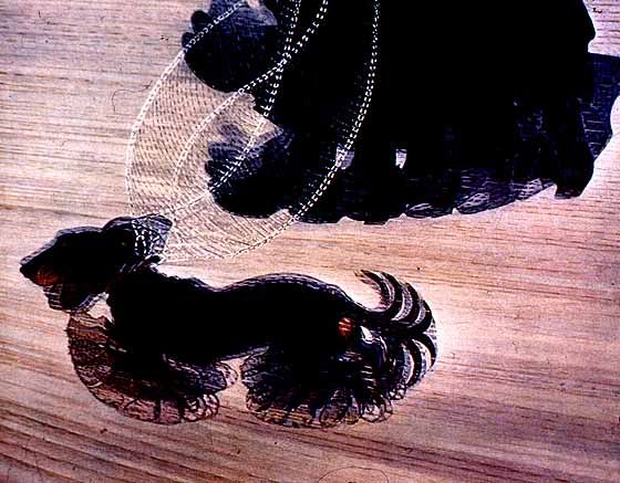
Giacomo Balla. Dynamism of a Dog on a Leash. (1912)
Name
My name, Nicole, means victory of the people.
My middle name, Lynette, means grace.
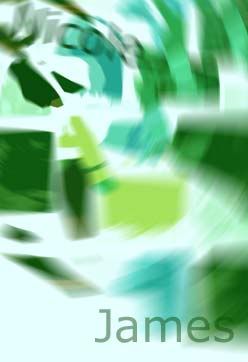
My last name, James, means son of Jacob.
In my designs I would like to explore the meaning of nicole meaning victory of the people, and lynette meaning grace.
Collages
In this collage I tried to make links between the squares for example by continuing the line of one sqare into the next. I also looked at similar patterns repeated in the "by shape" series. and in the green "by colour" series, i looked at lines leading through the series, and colour changing through the squares. In the "by texture" series, i took squares all from on black and white image, and isolated interesting patterns that you would have overlooked in the image as a whole but that are very interesting when taken out of context. Taking the squares from a black and white image removes colour from the equation and makes the texture the focus more.
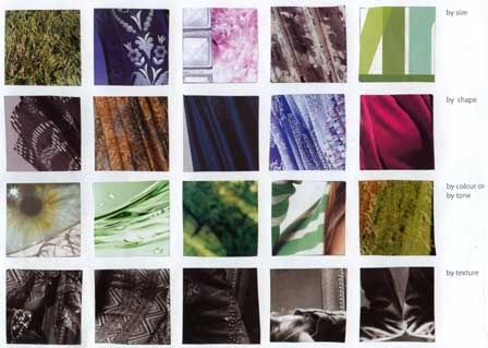
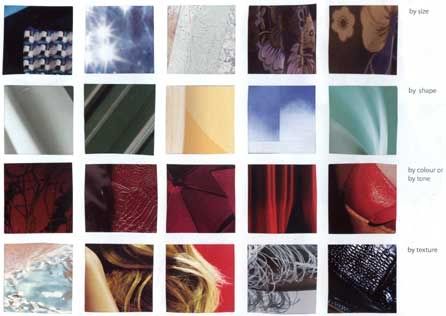
In the second collage I like the "by shape" series the best. I chose abstract shapes from pictures that were for example part of a door, but within the square they make interesting abstract shapes. I also like the red "by colour" row, which is very deep reds that show intersting textures and patterns that lead through the similar colour range. I also experimented with taking multiple squares from the same magizine image, for exaple in the 1st "by size" row, where smaller and larger flower patterns on the same dress are selected. Also in the "by texture" I selected an image of hair, that is two squares from next to each other in the photo, but put here make you look at the different texture of the arm, the hair and the ends of the hair against the red background.
Bruce Mau - Incomplete manifesto for growth
Some points that Bruce Mau makes are challenging, like:
3. Process is more important than outcome. When outcome drives the process we'll only ever go where we've already been. If process drives outcome we may not know where we are going, but we know we want to be there.
This challenges me to remember when designing to let the design process take me to new places. I want to be more driven by process rather than outcome, and I can practice this in uni assignments, by exploring possibilities and being influenced by what I discover and where the process takes me rather than being more stuck in an idea.
8. Drift. Allow yourself to wander aimlessly. Explore adjacencies. Lack judgement. Postpone criticism.
Sometimes I find it hard to make the time to explore happy accidents, and to postpone criticism, I can be too hard on myself which may lead me to discard an idea before I have developed it more through just drifting rather than being too task oriented.
15. Ask stupid questions. Growth is fuelled by desire and innocence. Asses the answer, not the question. Imagine learning throughout your life at the rate of an infant.
This reminds me that learning is about not knowing, but wanting to know. It would be great to be more childlike in the desire to learn. To learn through play, and to find the whole world exciting and see the possibilites and the intriguing in everything.
23. Stand on someones shoulders. You can travel further carried on the accomplishments of those who came before you. And the view is so much better.
I really need to explore other designers more. I realise that I don't have a favourite designer, and that makes me think that I really need to develop my awareness of other designers, and what has come before and what other people are doing. Just reading these readings has made me realise how exciting ideas there are that I have never explored yet. I want to expand my knowledge of design, what has come before, and get a better view from standing on their shoulders.
29. Think with your mind. Forget technology. Creativity is not device dependant.
This is a good reminder, because I feel like my skills are lacking, and I don't know how to use certain technology, and this limits my ideas. I need to remember to be creative in thinking, and then seeing how to do it, rather than thinking what I can do with the technology, and limiting my ideas to what I can do. It would be great to grow in skills to be able to achieve ideas, rather than to limit my ideas to what I am able to do.
Joshua Davis - Mentalities and Anomalies
This introduction is very inspiring, he begins saying that he doesn't know what he's doing and that there is power in confusion, mistakes and failures. It made me feel excited to remember the importance of trying new things just to see what happens, and that accidents and mistakes can be a very rich source of ideas.
He talks about testing things to the limits and seeing how far you can take it. And finding inspiration in black holes, anomalies and things that don't make sense. He makes the observation that while most people think that people have a 2 second attention span for catching attention on the web, his site draws people into participation even though (or because) they don't fully understand.
This made me think alot about what it is that makes things interesting, what makes a design catch your interst may be the things that intrigue you, or that don't explain themselves, and make you think and form associations of your own. He notes that people want to be less passive, they want to be involved and have a say, and effect how things turn out because of their involvement rather than just viewing.
His questions made me think about my experience and foundations, mentality and thinking. Its interesting to conciously be aware of the foundation that I am trying to design out of rather than just trying to produce a design. To think about what excites me, what I think about, what interests me and why. Would the things that inetest me translate into things that other people know and have experienced too. He talks about foundations as being stable but never static. If the foundations are static, they are dead. This reminds me about the way I am designing out of experience that is growing and changing, not constant.
I found this introduction extrememly inspiring, and made me want to explore Joshua Davis work and ideas further.