Design Development
I decided to develop this sketch further: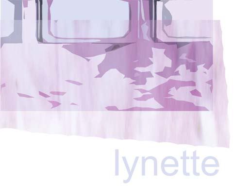
I took a band of the colours that I found in this sketch and played with them. I tried printing it out and doodling on it, handwriting the lynette, and drawing onto printouts of the design. Some of the printouts I crumpled up because I didn't like them. Then I scanned it. to give more texture and movement, like in a handmade graphic.
I used a hand drawn lynette to finish it off.
I then blurred the stripe on the computer, to give it a more fluid movement feel, which contrasts to the crinkled paper.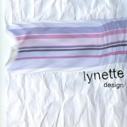
It reminds me too of the french flag in the "liberty leading the people" painting.
I think it has the feeling of movement in the stripe and crincled paper, even though the final print out will be flat, it has the feel of a worn piece of paper, that is an intersting texture to place as a CD cover, in a plastic box, very rigid and perfect. While the design is delibrately textured imperfectly.
posted by nicole @ 3:09 pm
![]()

0 Comments:
Post a Comment
<< Home